

CSS Code Snippets
Some small and simple code snippets from me.
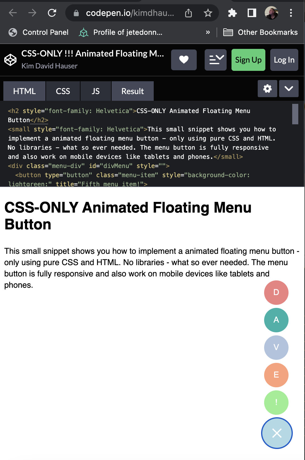
CSS (only) Floating Menu Button
This small snippet shows a CSS ONLY animated floating menu button.
Example
You can build and run this yourselfs, just copy the following code to its appropriate file and try it yourselfs. Happy coding!
CSS File
Save i.e. as “main.css”
1
2
3
4
5
6
7
8
9
10
11
12
13
14
15
16
17
18
19
20
21
22
23
24
25
26
27
28
29
30
31
32
33
34
35
36
37
38
39
40
41
42
43
44
45
46
47
48
49
50
51
52
53
54
55
56
57
58
59
60
61
62
63
64
65
66
67
68
69
70
71
72
73
74
75
76
77
78
79
80
81
82
83
84
85
86
87
88
89
90
91
92
93
94
95
96
97
98
99
100
101
102
103
104
105
106
107
108
109
110
111
112
113
114
115
116
.menu-div {
  position: absolute;
  bottom: 20px;
  right: 20px;
  display: inline-grid;
}

.menu-div .icon-bar:nth-of-type(2) {
  top: 2px;
}

.menu-div .icon-bar:nth-of-type(3) {
  top: 4px;
}

.menu-div .icon-bar {
  position: relative;
  transition: all 500ms ease-in-out;
  width: 20px;
  display: block;
  height: 2px;
  background-color: white;
}

.menu-div:hover .icon-bar:nth-of-type(1) {
  transform: translateY(6px) rotate(45deg);
}

.menu-div:hover .icon-bar:nth-of-type(2) {
  background-color: transparent;
}

.menu-div:hover .icon-bar:nth-of-type(3) {
  transform: translateY(-6px) rotate(-45deg);
}

.menu-div .menu-toggle {
  transition: all 500ms ease-in-out;
}

.menu-div:hover .menu-toggle {
  transform: rotate(-180deg);
}

.menu-toggle {
  width: 50px;
  height: 50px;
  padding-left: 10px;
  border-radius: 50%;
  z-index: 100;
  background-color: lightblue;
  border: 0px;
}

.menu-item {
  width: 40px;
  height: 40px;
  border-radius: 50%;
  margin-left: 4px;
  transition: all 750ms ease-in-out;
  transition-property: opacity, bottom;
  position: absolute;
  opacity: 0;
  bottom: -5px;
  z-index: 99;
  border: 0px;
  color: white;
  padding-top: 0px;
  padding-left: 6px;
}

.menu-div:hover .menu-item:nth-of-type(1) {
  bottom: 55px;
}

.menu-div:hover .menu-item:nth-of-type(2) {
  bottom: 100px;
}

.menu-div:hover .menu-item:nth-of-type(3) {
  bottom: 145px;
}

.menu-div:hover .menu-item:nth-of-type(4) {
  bottom: 190px;
}

.menu-div:hover .menu-item:nth-of-type(5) {
  bottom: 235px;
}

.menu-div:hover .menu-item {
  opacity: 1;
}

.menu-div .icon-bar {
  margin-left: 5px;
  position: relative;
}

button {
  position: relative;
}

button:is(.menu-item):active:after {
  content: attr(title);
  padding: 10px;
  border: 0px;
  border-radius: 7px;
  top: 50%;
  right: 50%;
  background: #00000077;
  color: #ffffff;
  position: fixed;
  transform: translate(50%, -50%);
}
HTML File
Save i.e. as index.html (and don’t forget to include the above CSS file)
1
2
3
4
5
6
7
8
9
10
11
12
13
14
15
16
17
18
19
20
21
22
23
24
25
26
27
28
29
30
31
32
<!DOCTYPE html>
<html>
	<head>
		<link href="main.css" rel="stylesheet" />
	</head>
	<body>
		<h2 style="font-family: Helvetica">CSS-ONLY Animated Floating Menu Button</h2>
		<small style="font-family: Helvetica">This small snippet shows you how to implement a animated floating menu button - only using pure CSS and HTML. No libraries - what so ever needed. The menu button is fully responsive and also work on mobile devices like tablets and phones.</small>
		<div class="menu-div" id="divMenu" style="">
		  <button type="button" class="menu-item" style="background-color: lightgreen;" title="Fifth menu item!">
		    !
		  </button>
		  <button type="button" class="menu-item" style="background-color: lightsalmon;" title="Fourth menu item!">
		    E
		  </button>
		  <button type="button" class="menu-item" style="background-color: lightsteelblue;" title="Third menu item!">
		    V
		  </button>
		  <button type="button" class="menu-item" style="background-color: lightseagreen;" title="Second menu item!">
		    A
		  </button>
		  <button type="button" class="menu-item" style="background-color: lightcoral;" title="First menu item!">
		    D
		  </button>
		  <button type="button" class="menu-toggle" data-target=".menu-div">
		    <span class="icon-bar" style="top: -4px;"></span>
		    <span class="icon-bar" style="top: 0px;"></span>
		    <span class="icon-bar" style="top: 4px;"></span>
		  </button>
		</div>
	</body>
</html>
Run / Test Example
Just place the two files in the same directory and link the CSS file correctly and you can test the effect by opening the index.html file in a browser (The Menubutton is bottom-right!!!). But you also can name the index.html as index.php and run a simple php webserver from this directory or whatever html renderer you need that supports CSS.
Effect Description
The menu expands on hover and the burger icon of the menu button animates to an “X”. No libraries are needed. JavaScript is needed only for setting the “active” state / CSS-Class to the menu, beside that no JS is needed and only pure CSS is used to render and animate this nice little menu.
Use and ammend the code as you like. The source is provided “AS IS” no warranty. The source is free for all your projects and plans whether it’s’ free or commercial. A reference to the author is highly appreciated.